
Case study · Brand Identity
Building Seventh Haven from the ground up.
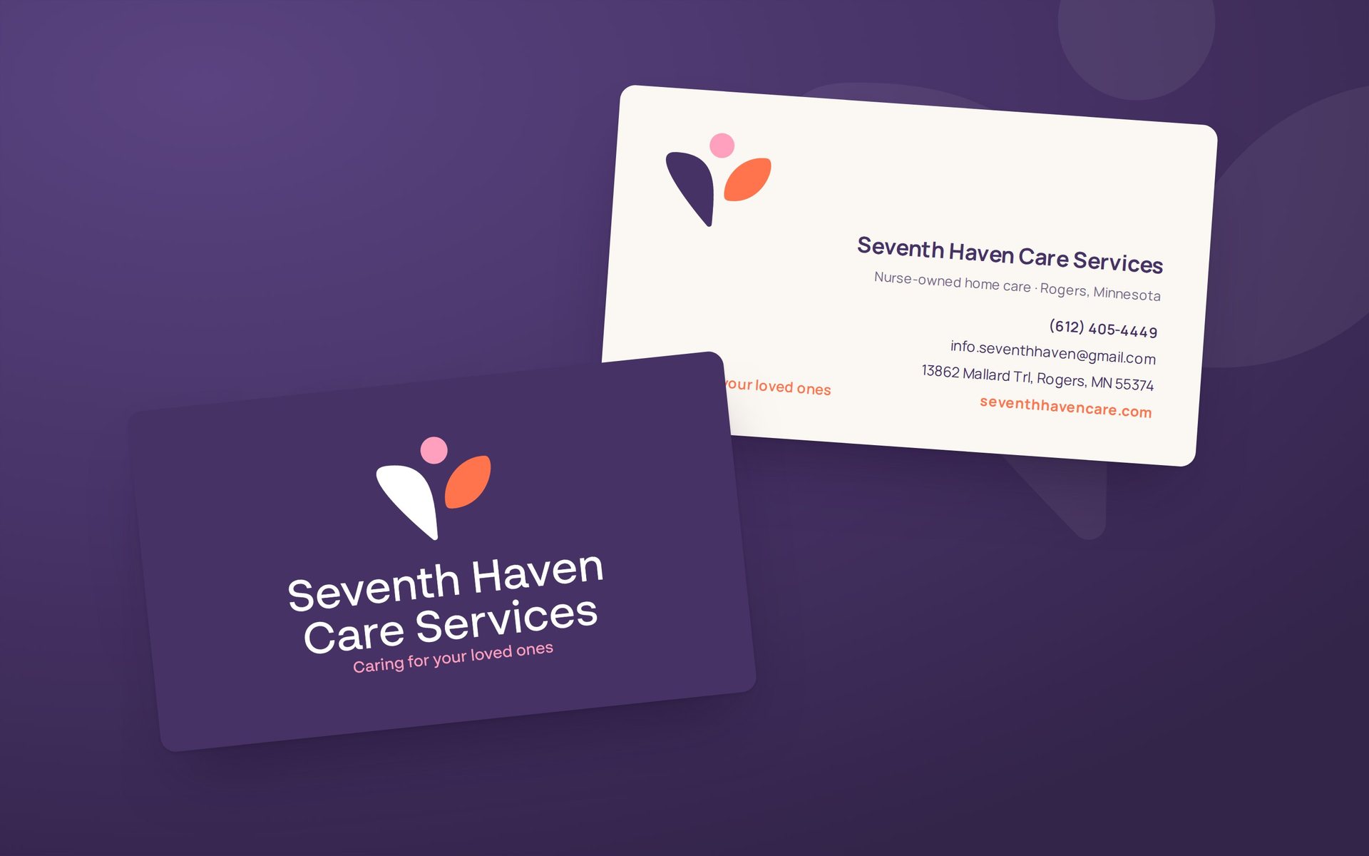
Seventh Haven Care Services is a nurse-owned home care agency in Rogers, Minnesota. Our team created their logo and visual identity so they could print business cards and launch their website with a look families and healthcare providers can trust.
The challenge
A new agency, ready to open its doors
Before Seventh Haven could hand out a card or launch a site, they needed an identity: something warm enough for families choosing care, and professional enough for the case managers and healthcare providers who refer clients.
Our approach
A figure, two leaves, one promise
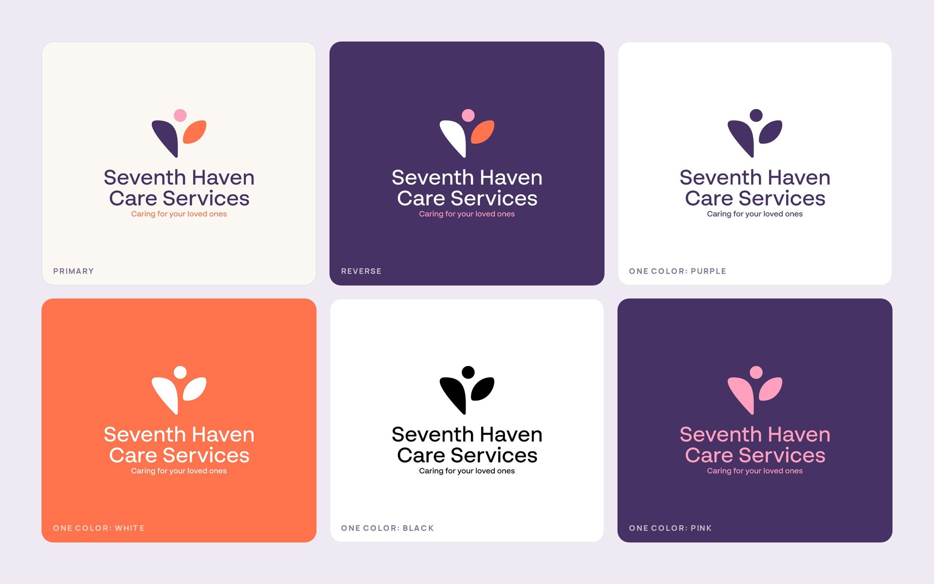
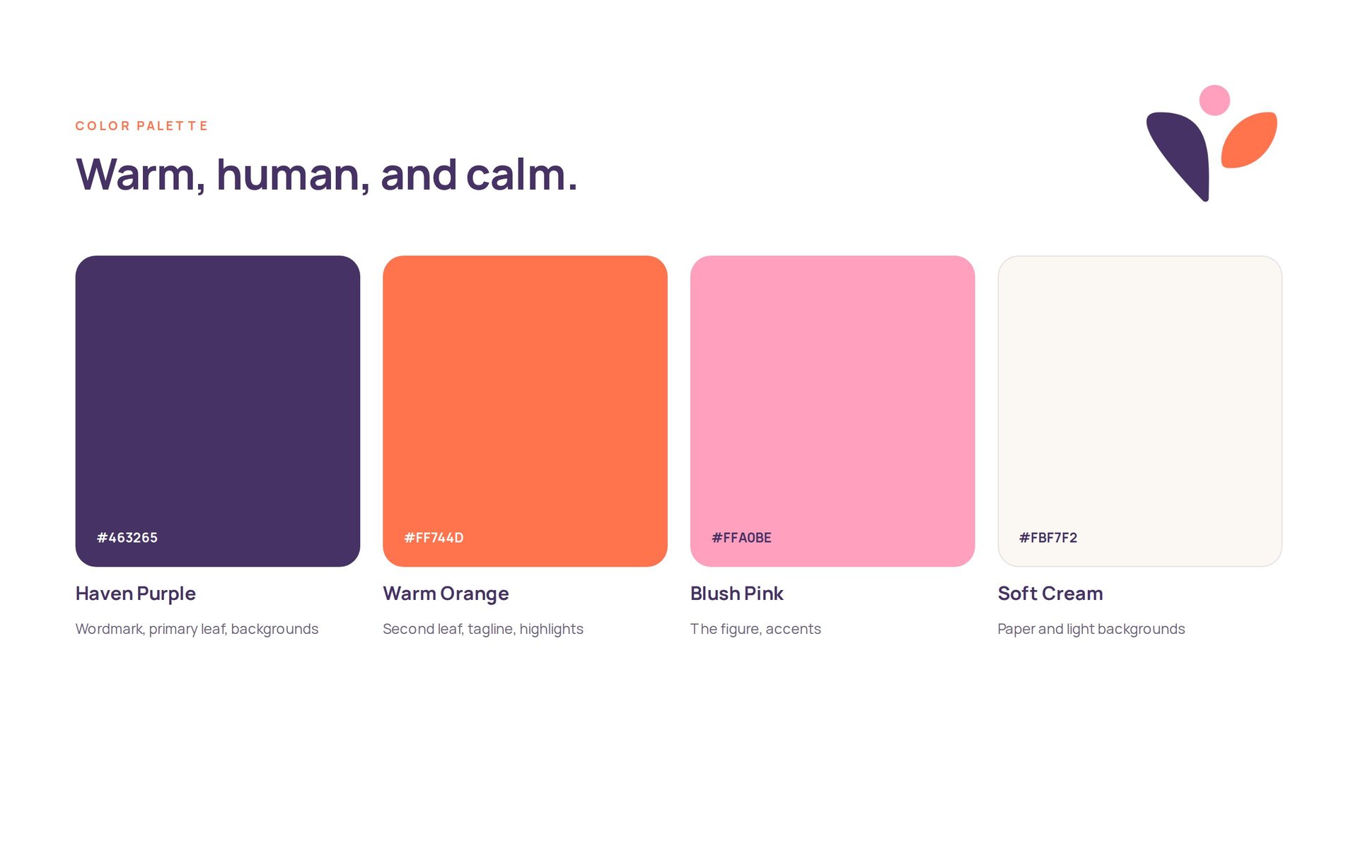
The mark shows a person held between two leaves, a quiet symbol of care and growth, in haven purple, warm orange and blush pink. We built it as a full system, with primary, reversed and one-color versions, paired with the line “Caring for your loved ones.”
The outcome
Launched with one consistent look
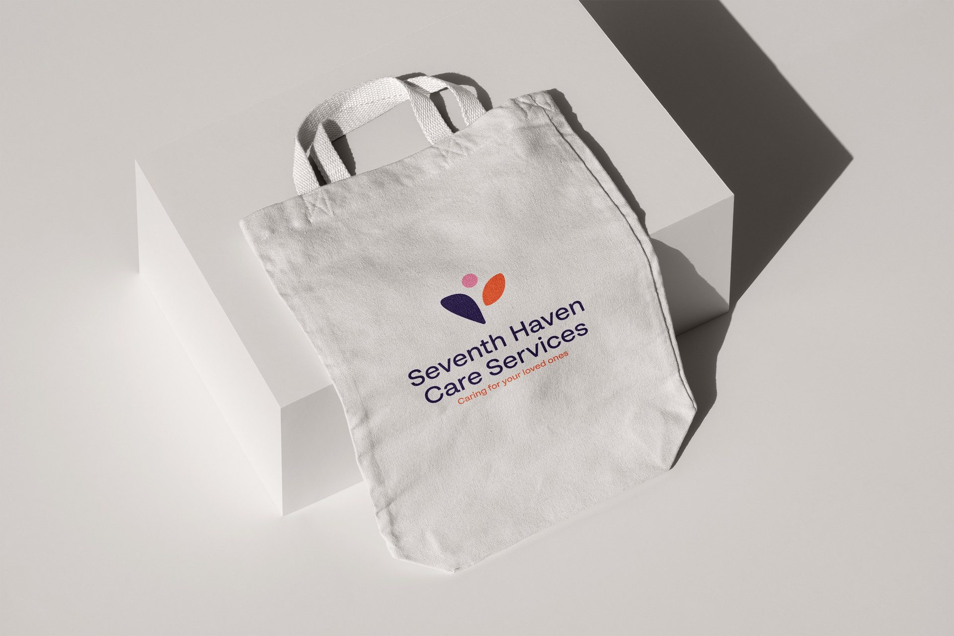
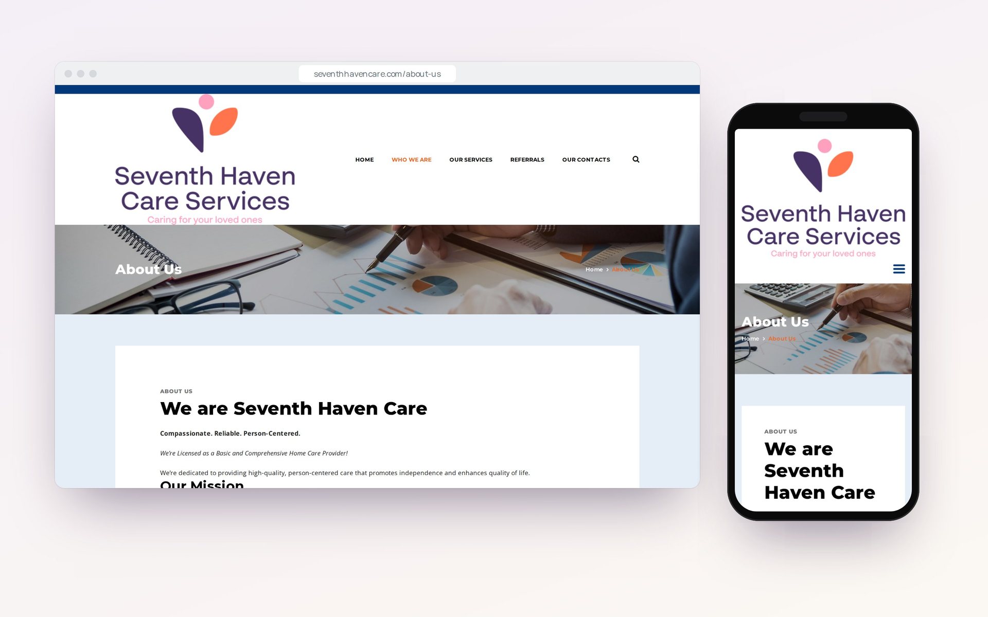
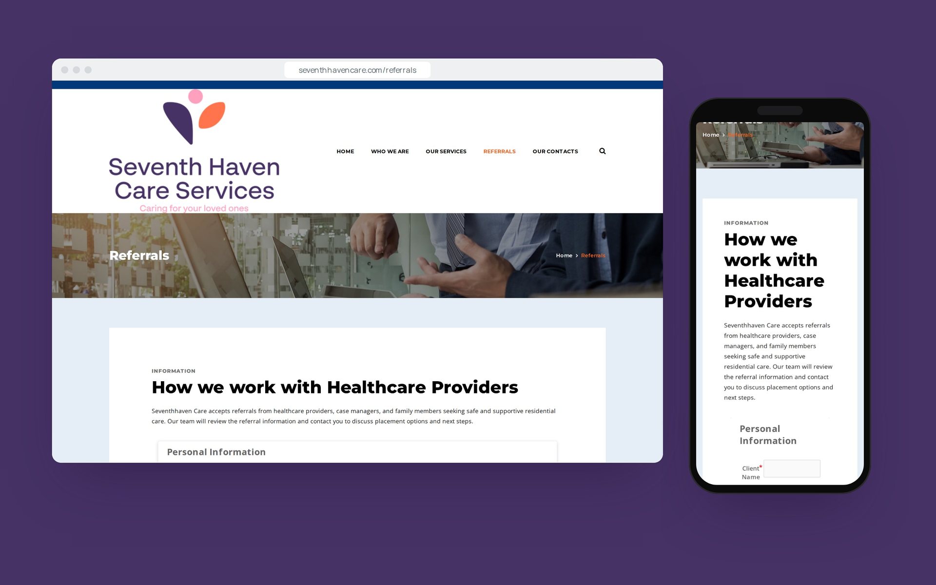
Seventh Haven launched with business cards and a website carrying the new logo, plus a complete set of logo files ready for signage, merchandise and social media.
What we delivered
What we delivered.
- 01
Logo and identity
The Seventh Haven mark and wordmark, with primary, reversed and one-color versions and a four-color palette.
- 02
Business cards
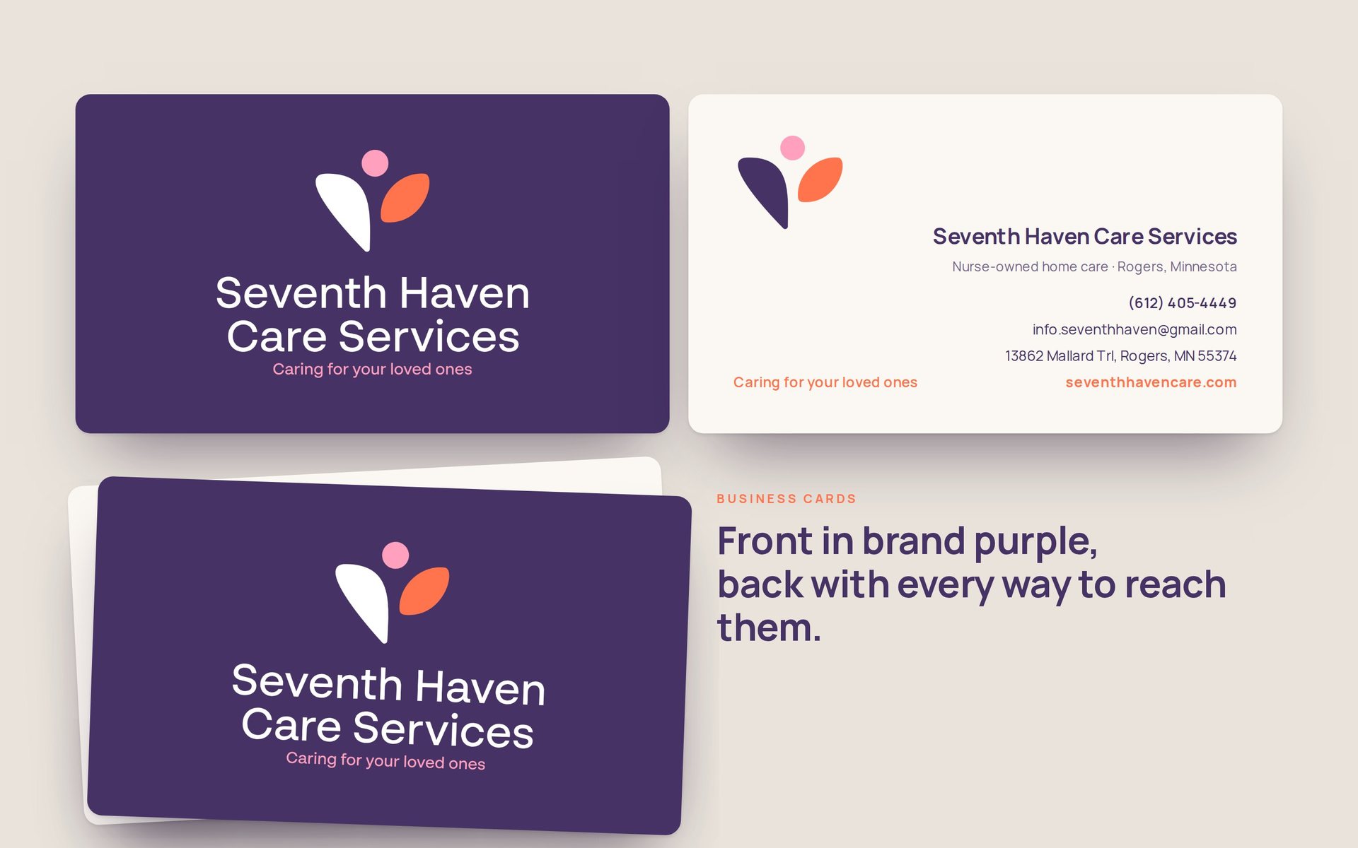
A purple front carrying the reversed logo and a cream back with every way to reach the agency.
- 03
Launch-ready files
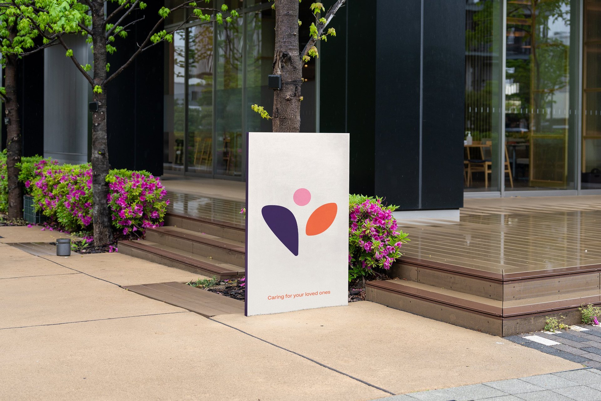
Logo files prepared for the new website, signage, merchandise and social media profiles.
The work
A closer look.
“Moo2ri played a key role in building Seventh Haven from the ground up, from the name and brand direction to how we present ourselves today. Everything feels intentional, and the difference is clear in how people respond to us.”
Your brand has more potential
Let’s talkBook a free 30-minute strategy call, or email info@moo2ri.com