
Case study · Rebrand
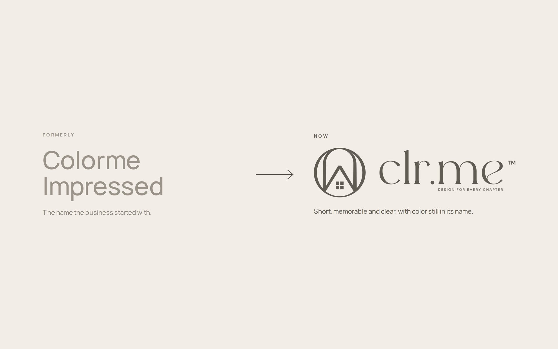
From Colorme Impressed to clr.me.
A complete revamp: a new name, a new logo and a first wave of brand content that gave the company a clear direction forward.
The challenge
A name ready for its next chapter
Colorme Impressed was ready for a bigger step. The business needed an identity that was easy to remember, worked everywhere from a storefront to a social avatar, and showed clearly where the company was heading.
Our approach
Keep the color, clear the clutter
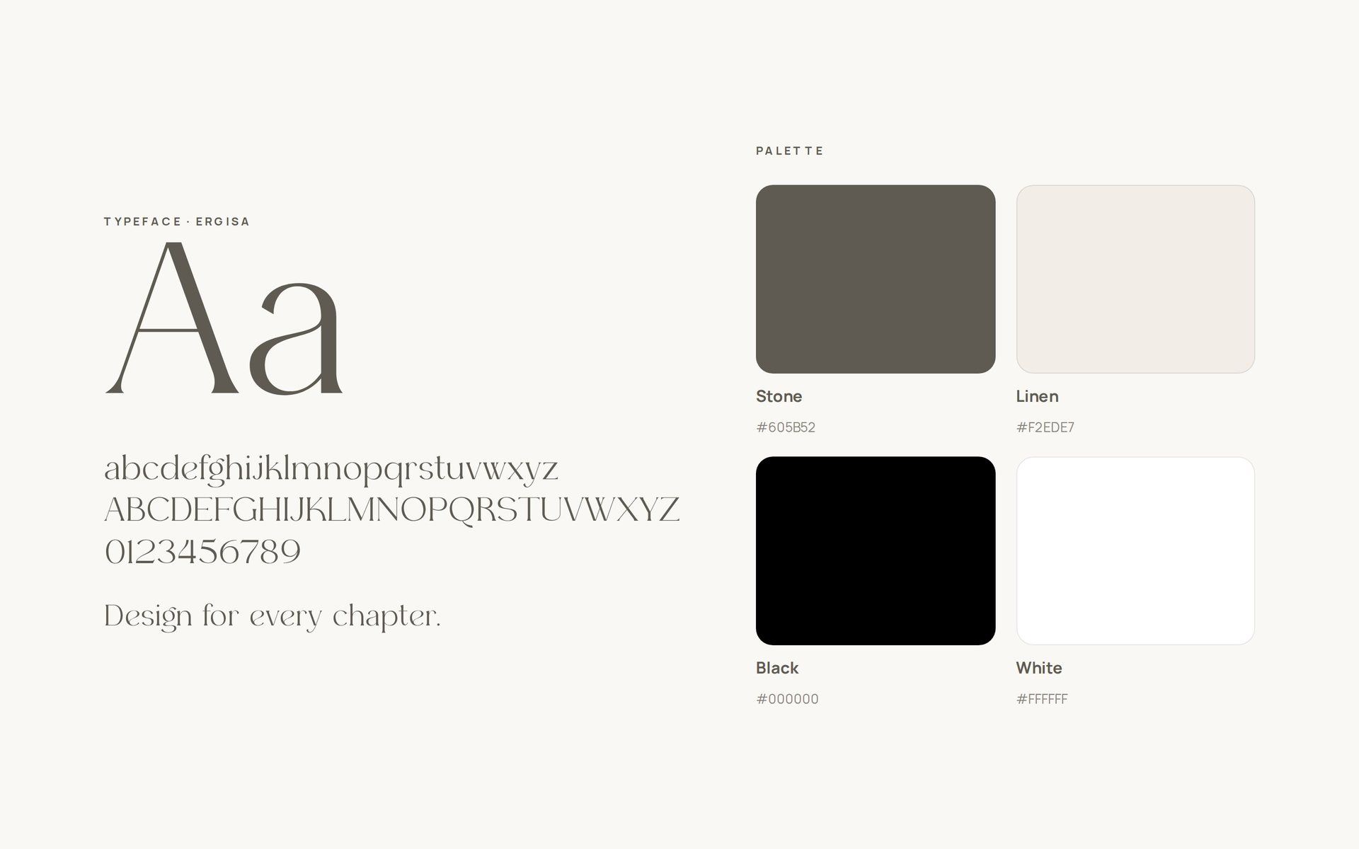
We distilled the old name into clr.me: short, easy to say, with color still at its core. The mark places a home inside a circle, paired with the line “Design for every chapter,” set in Ergisa with a calm stone and linen palette.
The outcome
A clear direction forward
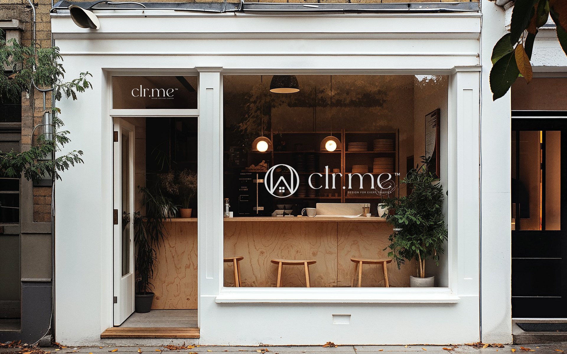
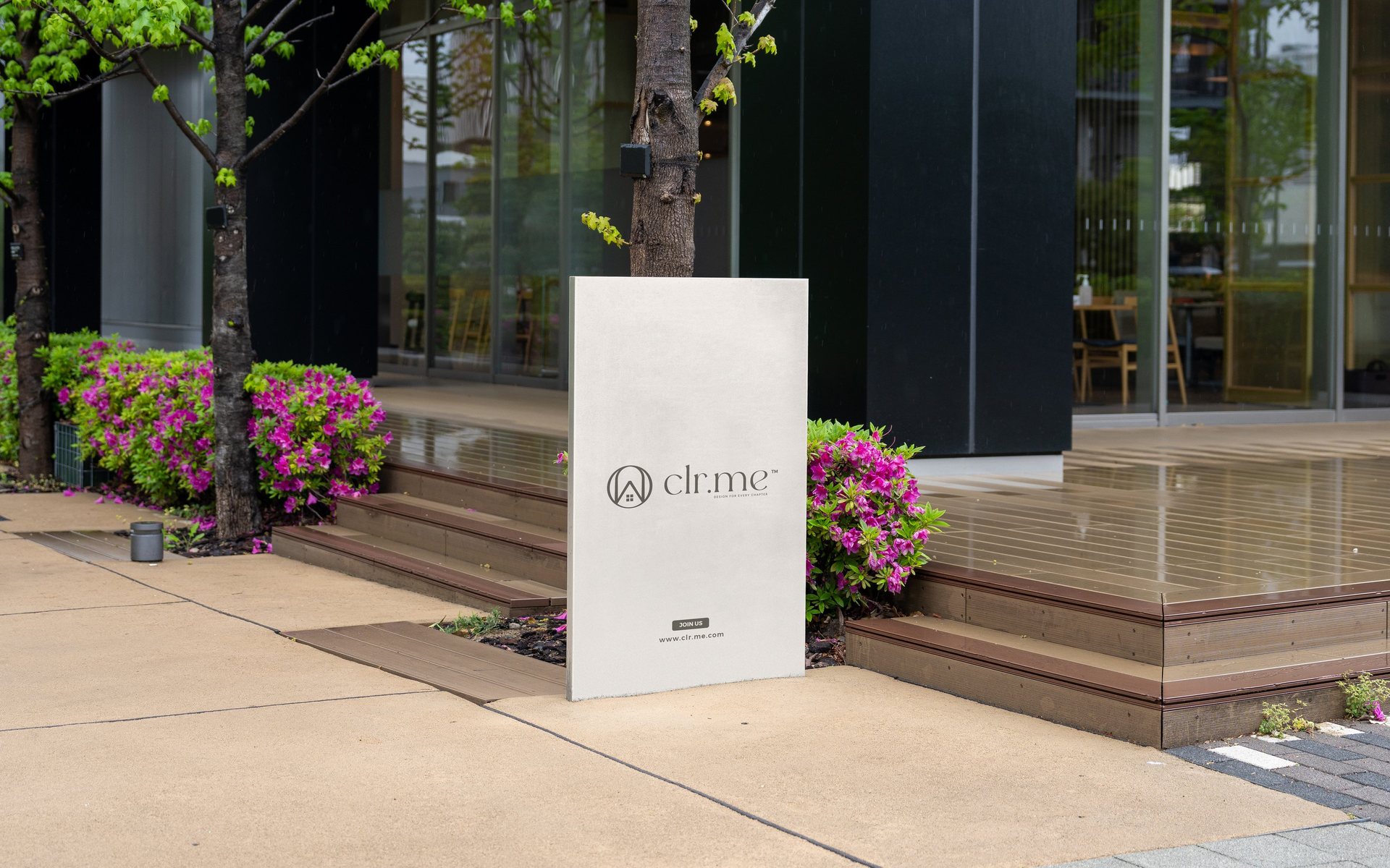
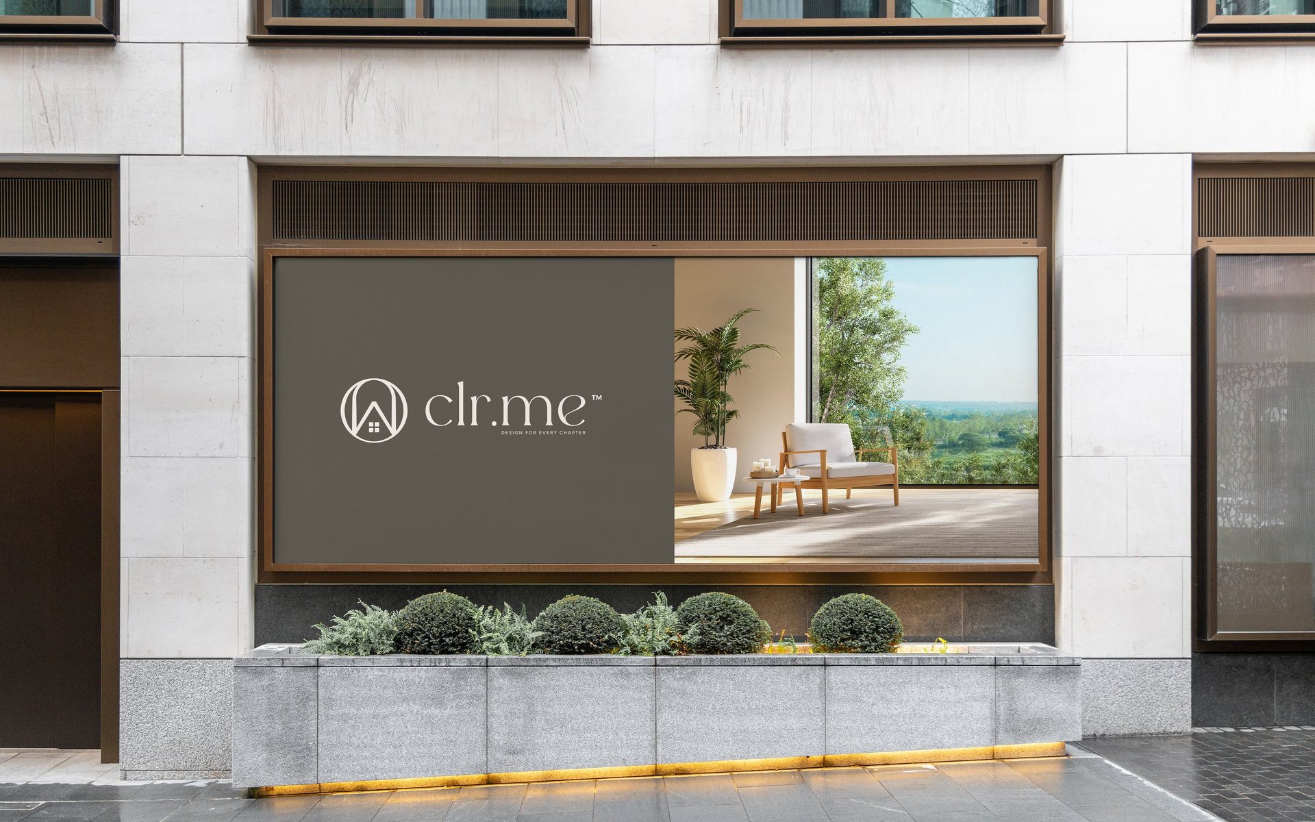
clr.me launched with a complete logo system, social profile assets, signage and storefront applications, and an animated brand intro: one consistent identity for the company to grow with.
What we delivered
The revamp.
- 01
Naming
From Colorme Impressed to clr.me: a shorter name that keeps color at its heart.
- 02
Logo and identity
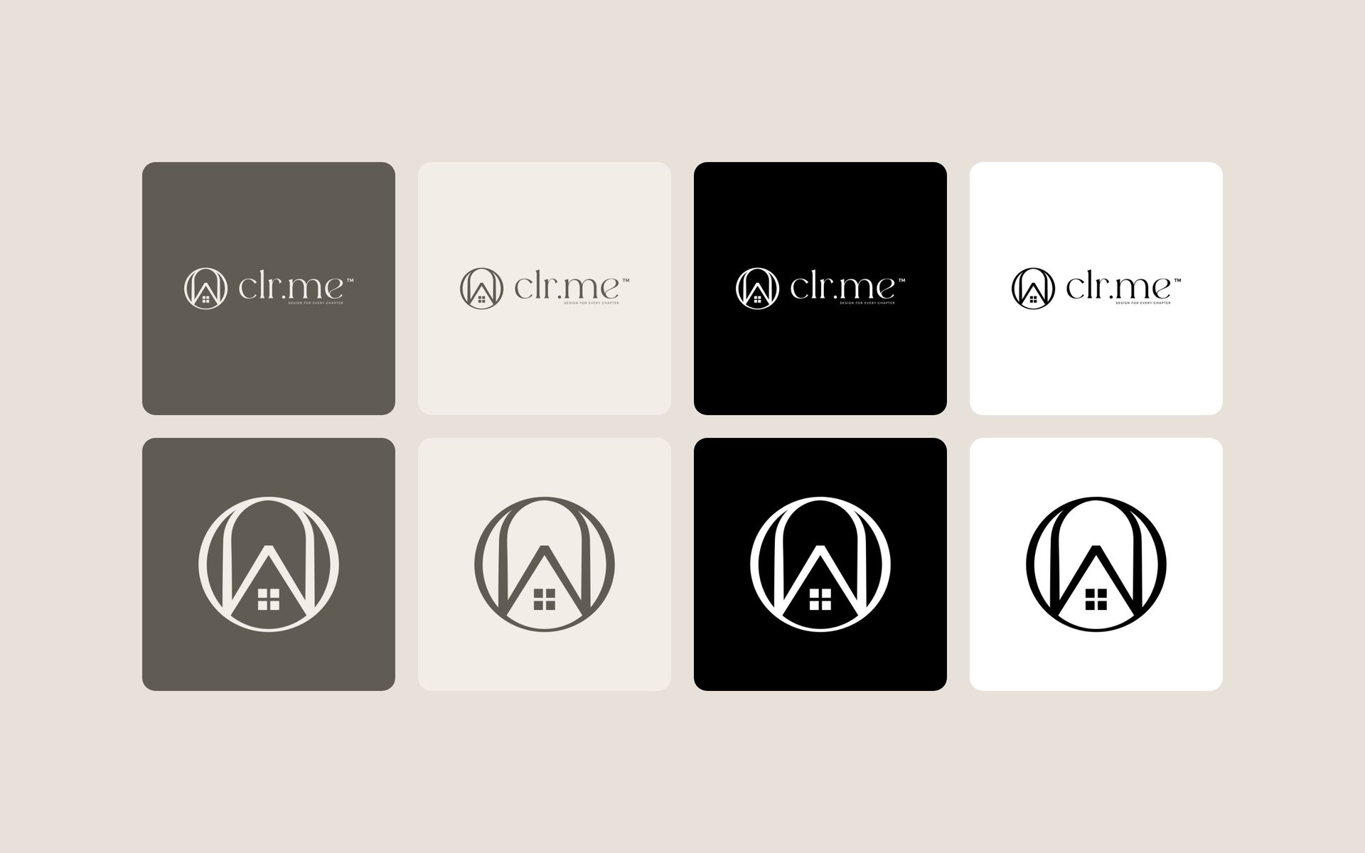
A home-in-a-circle mark and wordmark in eight versions, the Ergisa typeface and a stone, linen, black and white palette.
- 03
Brand content
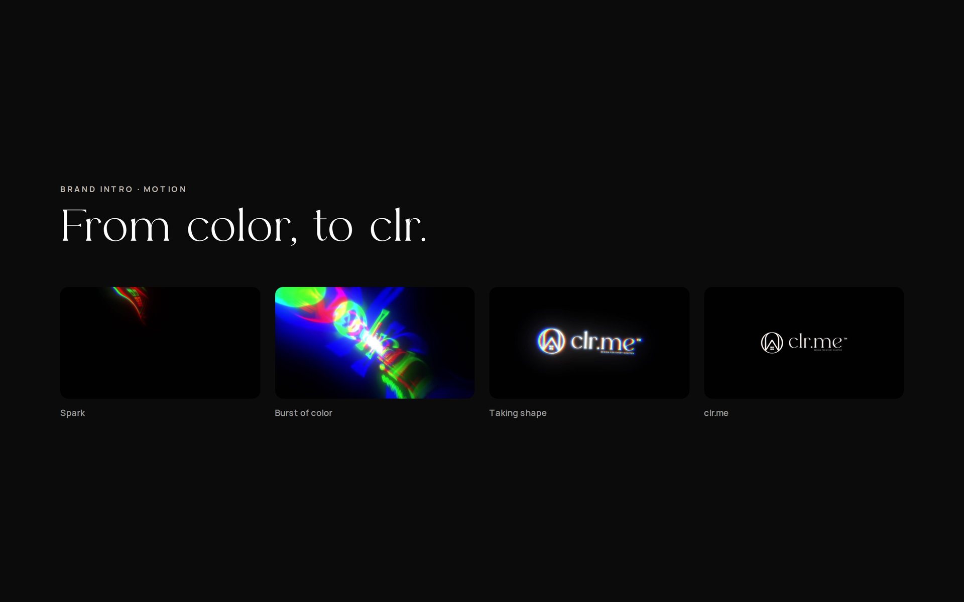
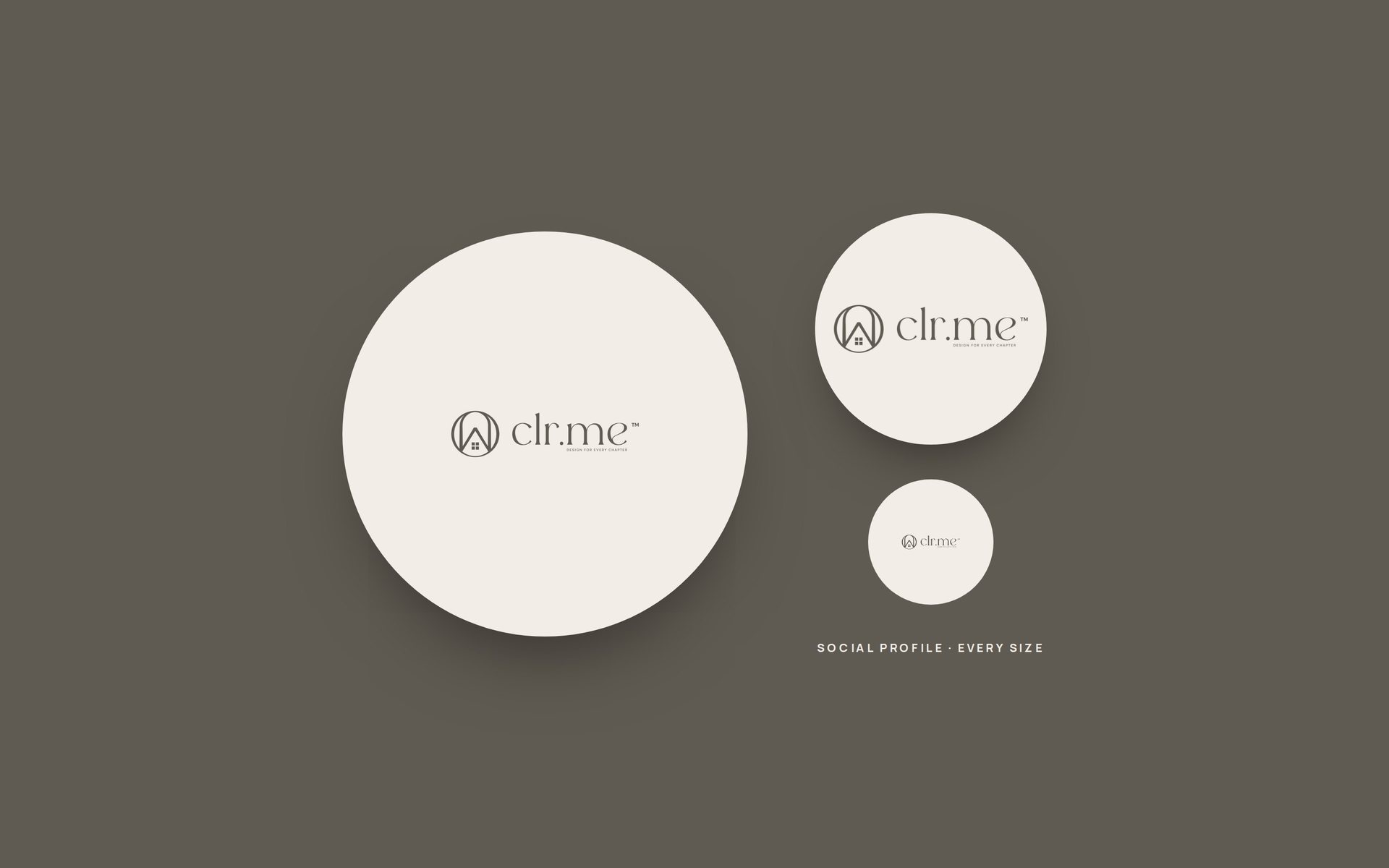
An animated logo intro, social profile images, and signage and storefront mockups to launch the new name.
The work
A closer look.
Your brand has more potential
Let’s talkBook a free 30-minute strategy call, or email info@moo2ri.com